Controlling Plotting Functions#
Note
Download the example file here: HP3_TE300_SPC630.hdf5
First, let’s run the following code to generate a basic analysis for us to begin working with. This code is essential the same as that found in the tutorial .
[1]:
import numpy as np
from matplotlib import pyplot as plt

import fretbursts as frb
import burstH2MM as bhm

filename = 'HP3_TE300_SPC630.hdf5'
# load the data into the data object frbdata
frbdata = frb.loader.photon_hdf5(filename)
# if the alternation period is correct, apply data
# plot the alternation histogram
# frb.bpl.plot_alternation_hist(frbdata) # commented so not displayed in notebook
frb.loader.alex_apply_period(frbdata)
# calcualte the background rate
frbdata.calc_bg(frb.bg.exp_fit, F_bg=1.7)
# plot bg parameters, to verify quality
# frb.dplot(frbdata, frb.hist_bg) # commented so not displayed in notebook
# now perform burst search
frbdata.burst_search(m=10, F=6)
# make sure to set the appropriate thresholds of ALL size
# parameters to the particulars of your experiment
frbdata_sel = frbdata.select_bursts(frb.select_bursts.size, th1=50)
# make BurstData object to get data into bursth2MM
bdata = bhm.BurstData(frbdata_sel)
# calculate models
bdata.models.calc_models()
 - Optimized (cython) burst search loaded.
 - Optimized (cython) photon counting loaded.
--------------------------------------------------------------
 You are running FRETBursts (version 0.7.1).

 If you use this software please cite the following paper:

   FRETBursts: An Open Source Toolkit for Analysis of Freely-Diffusing Single-Molecule FRET
   Ingargiola et al. (2016). http://dx.doi.org/10.1371/journal.pone.0160716

--------------------------------------------------------------
# Total photons (after ALEX selection):    11,414,157
#  D  photons in D+A excitation periods:    5,208,392
#  A  photons in D+A excitation periods:    6,205,765
# D+A photons in  D  excitation period:     6,611,308
# D+A photons in  A  excitation period:     4,802,849

 - Calculating BG rates ... get bg th arrays
Channel 0
[DONE]
 - Performing burst search (verbose=False) ...[DONE]
 - Calculating burst periods ...[DONE]
 - Counting D and A ph and calculating FRET ...
   - Applying background correction.
   [DONE Counting D/A]
The model converged after 1 iterations
The model converged after 34 iterations
The model converged after 122 iterations
The model converged after 395 iterations
[1]:
2
Global Plot Customizations#
The central plotting functions of burstH2MM are all highly customizable.
The first and simplest form of customization is using the ax keyword argument, which is universal to all plotting functions.
This lets you make a matplotlib.axes (usually made with plt.subplots() or related functions), and then plot all elements within that axes.
This also lets overlapping different plots into one axes.
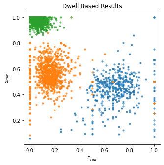
So here’s an example, and we’ll set the title of the axes afterward:
[2]:
# make the axes
fig, ax = plt.subplots(figsize=(5,5))
bhm.dwell_ES_scatter(bdata.models[2], ax=ax)
ax.set_title("Dwell Based Results");
For E and S based parameters, there is the option to use the raw values (calculated from the photons alone), or the values corrected for the values set for leakage, direct excitation, gamma and beta that have been set in the fretbursts.Data object used to create the BurstData object that you are working on.
For dwell based parameters, corrections for background are also applied.
Note
See the On demand data creation section to understand how, and most importantly when parameters are calculated.
Make sure that your leakage , dir_ex , gamma and beta values are set before you try to plot or otherwise access any dwell value that involves correcting for these factors.
If you want to recalculate, use the H2MM_result.trim_data() method on your H2MM_result object to clear the value:
This is done quite simply using the add_corrections keyword argument:
[3]:
# trim data, NOT necessary if corrected values have not been accessed yet
bdata.models[2].trim_data()

fig, ax = plt.subplots(figsize=(5,5))
# add correction factors (determine for your own setup)

bdata.data.leakage = 0.0603
bdata.data.dir_ex = 0.0471
bdata.data.gamma = 1.8
bdata.data.beta = 0.69
# note the addition of add_corrections=True
bhm.dwell_ES_scatter(bdata.models[2], add_corrections=True, ax=ax)
# set limits on the values, since with corrections, some dwells with
# few photons in a stream will have extreme values
ax.set_xlim([-0.2, 1.2])
ax.set_ylim([-0.2, 1.2]);
   - Applying background correction.
   - Applying leakage correction.
   - Applying background correction.
   - Applying leakage correction.
   - Applying direct excitation correction.

Customizing plots by state#
Additional customizations focus on how states are individually plotted. This is done by passing lists of keyword argument dictionaries to specific keyword arguments.
The first of these keyword arguments we will explore is state_kwargs .
This is universal to all plotting functions beginning with dwell_ .
For it you pass a list of dictionaries of keyword arguments for the underlying matploplib function, one dictionary for each state.
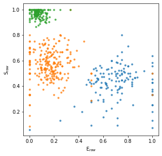
Here’s a simple example, where we assign a color to each state in the dwell_ES_scatter() plot:
[4]:
# set up list, same length as number of states in the model
state_color = [{'color':'m'}, {'color':'yellow'}, {'color':'c'}]
bhm.dwell_ES_scatter(bdata.models[2], state_kwargs=state_color);
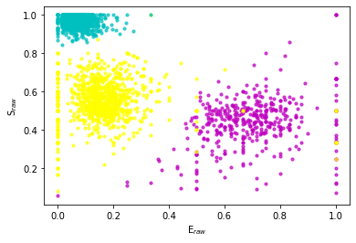
So what happened here? Since models[2] has 3 states, the input state_kwargs keyword argument needs to be a list or tuple of length 3.
The model stores states in arrays, which gives the states an arbitrary order.
Each element of the list is passed per state to the ax.scatter() function as keyword arguments, according to the order established in the model.
So the first state gets the keyword argument color='m' , the second state color='yellow' and the third color='m' .
Note
The different plotting functions use different matplotlib and seaborn functions. So plotting functions that create histograms use ax.hist() , while scatter functions use ax.scatter() , and kde plot functions use sns.kdeplot()
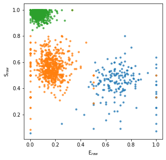
Displaying subsets of states#
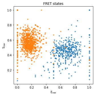
What if you want to only look at a few states?
You can select, and control the order of the plotting of different states with the states keyword argument.
Let’s say we want to only look at the FRET states (which are the 0th and 1st states in sample data set, but might be different when you are using other datasets). To do this, we make an array of just the indices of those states, and then pass that array to the states keyword argument:
[5]:
# make the axes
fig, ax = plt.subplots(figsize=(5,5))

# specify the states we want
states = np.array([0, 1])

# now we plot
bhm.dwell_ES_scatter(bdata.models[2], ax=ax, states=states)
ax.set_title("FRET states");
Selecting states and controlling their plotting#
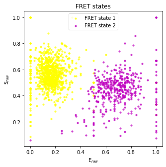
So how do we combine the states and state_kwargs ?
It’s pretty simple, states serves like a “master”, and so each state specified in states is matched with an element of state_kwargs , assuming they come in the same order.
So, you specify state_kwargs dictionaries in the same order as the states you specify in states, and obviously, they need to be the same length, otherwise you will get an error.
So here’s an example where we re-plot the FRET states, but in reverse order, and see how the state_kwargs are also reordered:
[6]:
# make the axes
fig, ax = plt.subplots(figsize=(5,5))

# specify the states we want, now with 1 before 0
states = np.array([1, 0])
# make the state_kwargs, we'll add labels this time
state_kwargs = [{'color':'yellow', 'label':'FRET state 1'}, {'color':'m', 'label':'FRET state 2'}]

# now we plot
bhm.dwell_ES_scatter(bdata.models[2], ax=ax, states=states, state_kwargs=state_kwargs)

# add title, and legend to the plot
ax.set_title("FRET states")
ax.legend();
State Overlays#
Especially for E-S plots, burstH2MM provides a number of overlays for adding markers for where the model value of each state.
The scatter_ES() function#
The first, already introduced in the tutorial is the scatter_ES() :
Note
Since states often do not span the entire (0, 1) range of E and S, we manually set these in the plot bellow. When combined with dwell-based plots however, those plots usually automatically set the range to something reasonable. Therefore it is more often than not unnecessary to set the x and y axes limits.
[7]:
fig, ax = plt.subplots(figsize=(5,5))

bhm.scatter_ES(bdata.models[2], ax=ax)

ax.set_xlim([0,1])
ax.set_ylim([0,1]);

Specific states can be specified in the same way as with the other dwell-based plotting functions, through the states keyword argument, and add_corrections is also present.
Additional keyword arguments are forwarded to ax.scatter()
[8]:
fig, ax = plt.subplots(figsize=(5,5))

bhm.scatter_ES(bdata.models[2], ax=ax, states=np.array([0,1]), c='k', add_corrections=True)

ax.set_xlim([0,1])
ax.set_ylim([0,1]);

The trans_arrow_ES() function#
Another useful function, is trans_arrow_ES()
This allows the incorporation of arrows indicating the transition rates directly into the plots.
We also have the standard add_corrections keyword argument that works the same as in all other places, whether or not to plot corrected or raw parameter values.
Under to hood, trans_arrow_ES() calls ax.annotate() , so additional keyword arguments are passed along to it, like in other Plotting functions.
[9]:
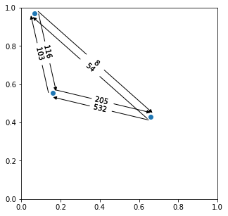
fig, ax = plt.subplots(figsize=(5,5))

bhm.scatter_ES(bdata.models[2], ax=ax, add_corrections=True)
bhm.trans_arrow_ES(bdata.models[2], ax=ax, add_corrections=True, fontsize=11)

ax.set_xlim([-0.1,1.1])
ax.set_ylim([-0.1,1.1]);

The trans_arrow_ES() Minimum Rate Filter#
If you are using the same data that this documentation was produced with, you will notice that in the above plot, one arrow seems to be missing.
Between the donor-only and high-FRET states, there is only the high-FRET to donor-only transition, but the reverse rate does not appear.
It is note because it does not exist, but rather, this rate is so slow that trans_arrow_ES() chooses not the plot it.
The excat threshold bellow which a transition is considered irrelevant through the min_rate keyword arguemnt.
The default is min_rate=1e1 , so we know that this transition rate is slower that 10 s-1.
For the data we are using, it turns out that the transition rate is just barely under this threshold, so let’s set min_rate=1.0 so we will lower the threshold by an order of magnitude, and so see all the transition rates.
[10]:
fig, ax = plt.subplots(figsize=(5,5))

bhm.scatter_ES(bdata.models[2], ax=ax)
bhm.trans_arrow_ES(bdata.models[2], ax=ax, min_rate=1.0)

ax.set_xlim([0,1])
ax.set_ylim([0,1]);
Of course, this default is actually rather slow, since H 2MM is far more sensitive to transition rates that are on the scale of burst durations (milliseconds), let’s raise the threshold so we don’t see any of the transitions between the donor-only and high-FRET states:
[11]:
fig, ax = plt.subplots(figsize=(5,5))

bhm.scatter_ES(bdata.models[2], ax=ax)
bhm.trans_arrow_ES(bdata.models[2], ax=ax, min_rate=1e2)

ax.set_xlim([0,1])
ax.set_ylim([0,1]);

Basic trans_arrow_ES() customizations#
Some other customizations for the display of trans_arrow_ES() are:
- positions : set where the number is displayed, either as a single number, or as an array of the same shape as the transition probability matrix
- sep the separation between forward and backward transition rate arrows
- fstring the number format for the transition rate, same as used in python f-strings
- unit whether to display the units of transition rate
- rotate whether to dispaly the transition rate rotated with the arrow, or always horizontally
So lets see some examples:
First we will set the positions=0.4 so instead of the numbers being placed directly in the middle, they will be a little closer to from_state , and we will set fstring='1.1e so that now units will be given in scientific notation, and we’ll set unit=True so we can see the units:
[12]:
fig, ax = plt.subplots(figsize=(5,5))

bhm.scatter_ES(bdata.models[2], ax=ax)
bhm.trans_arrow_ES(bdata.models[2], ax=ax, positions=0.4, fstring='1.1e', unit=True)

ax.set_xlim([0,1])
ax.set_ylim([0,1]);

Now let’s see the numbers horizontal and increase the separation between arrows:
[13]:
fig, ax = plt.subplots(figsize=(5,5))

bhm.scatter_ES(bdata.models[2], ax=ax)
bhm.trans_arrow_ES(bdata.models[2], ax=ax, sep=4e-2, rotate=False)

ax.set_xlim([0,1])
ax.set_ylim([0,1]);

Also, if you want, you can specify the positions as an array (organized [from_state, to_state] , diagonal elements ignored):
[14]:
fig, ax = plt.subplots(figsize=(5,5))

bhm.scatter_ES(bdata.models[2], ax=ax)
pos = np.array([[0, 0.4, 0.4],[0.6, 0.0, 0.5],[0.6, 0.5, 0.0]])
bhm.trans_arrow_ES(bdata.models[2], ax=ax, sep=4e-2, positions=pos)

ax.set_xlim([0,1])
ax.set_ylim([0,1]);

Manually selecting states for trans_arrow_ES()#
trans_arrow_ES() has states and state_kwargs keyword arguments, but they behave a little differently from those same arguments in other Plotting functions, becuase it is concerned with transitions, as opposed to states.
Now states is given as a list/tuple of 2 element arrays
Note
Even if you are only plotting a single transition rate, the input to states must be “2-dimensional”.
Meaning that it cannot be just [from_state, to_state] but rather [[from_state, to_state], ]
[15]:
fig, ax = plt.subplots(figsize=(5,5))

bhm.scatter_ES(bdata.models[2], ax=ax, states=(0,1))
bhm.trans_arrow_ES(bdata.models[2], ax=ax, states=((0,1), (1,0)))

ax.set_xlim([0,1])
ax.set_ylim([0,1]);

Customizing the arrows#
state_kwargs is a list of dictionaries.
The arrows in trans_arrow_ES() , as mentioned before are created using ax.annotate() but it is a little more compliacted, as for every transition, 2 annotations are actually created.
These are the from arrow and to arrow annotations, which link the from state and to state positions to the central transition rate number.
Basically the from arrow starts at the rate and points to the from state (and by default is just a line, and thus has no arrow head). While the to arrow starts at the rate and points to the to state.
In order to change the size, style etc. of the arrows, there are the from_arrow , to_arrow keyword arguments to set the overall arrow style, and the from_props and to_props keyword arguments set additional properties of these arguments.
Since there are two types of arrows, it is necessary to allow separate specification of certain ax.annotate() keyword arguments.
Specifically, this means modifying the arrowprops keyword argument of ax.annotate() , which is itself necessarily a dictionary.
from_arrow and to_arrow arguments are packaged into the arrowstyle keyword argument for matplotlib.patches.FancyArrowPatch , which is handed there via the arrowprops keyword argument of ax.annotate() , by updating the default dictionary with the user provided arguments, so defaults are not lost.
from_props and to_props are packaged into the arrowprops keyword argument, and thus serve as other keyword arguments to matplotlib.patches.FancyArrowPatch , again, by updating the default dictionaries so defaults are not lost.
Finally, there is the arrowprops keyword argument, which is basically a way of passing the same argument to both from_props and to_props , and again it works by updating the dictionaries.
So let’s see examples of how these work:
The thickness and color of the arrows can be set in the arrowprops via the key linewidth :
[16]:
fig, ax = plt.subplots(figsize=(5,5))

bhm.scatter_ES(bdata.models[2], ax=ax)
bhm.trans_arrow_ES(bdata.models[2], ax=ax, arrowprops=dict(linewidth=4.0))

ax.set_xlim([-0.1,1.1])
ax.set_ylim([-0.1,1.1]);

We can give individual colors or different linewidths to the from arrow and to arrow with the from_arrow and to_arrow keyword arguments:
[17]:
fig, ax = plt.subplots(figsize=(5,5))

bhm.scatter_ES(bdata.models[2], ax=ax)
bhm.trans_arrow_ES(bdata.models[2], ax=ax, from_props=dict(linewidth=2.0, color='m'),
                   to_props=dict(linewidth=4.0, color='b'))

ax.set_xlim([-0.1,1.1])
ax.set_ylim([-0.1,1.1]);

As you will note near the top of the matplotlib documentation pages, passing some strings to from_arrow and to_arrow can make the arrows take on different shapes at their ends:
[18]:
fig, ax = plt.subplots(figsize=(5,5))

bhm.scatter_ES(bdata.models[2], ax=ax)
bhm.trans_arrow_ES(bdata.models[2], ax=ax, to_arrow='wedge', from_arrow='<|-')

ax.set_xlim([-0.1,1.1])
ax.set_ylim([-0.1,1.1]);

axline_E() and#
For times when you want to plot histograms, there also are a set of functions that plot bars for states.
We have axline_E() , and axline_S() , which have the same fundamental function signature.
The add_corrections , states and state_kwargs keyword arguments all work the same as in scatter_ES() .
So add_corrections sets whether or not to plot the corrected values, as opposed to the raw values.
states is an array of the states that are to be plotted, and state_kwargs is a list or tuple of dictionaries that are the keyword arguments for either ax.axvline() or ax.axhline() .
There is a keyword argument horizontal that sets whether to plot horizontal bars ( horizontal=True ) or the default of vertical bars ( horizontal=False ).
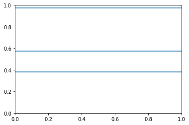
[19]:
fig, ax = plt.subplots()

bhm.axline_E(bdata.models[2], states=np.array([0,2]), state_kwargs=({'c':'r'}, {'c':'b'}))
[19]:
[<matplotlib.lines.Line2D at 0x7f6e079f8760>,
 <matplotlib.lines.Line2D at 0x7f6e079b0640>]

[20]:
fig, ax = plt.subplots()

bhm.axline_S(bdata.models[2], add_corrections=True, horizontal=True)
[20]:
[<matplotlib.lines.Line2D at 0x7f6e07953910>,
 <matplotlib.lines.Line2D at 0x7f6e0790d130>,
 <matplotlib.lines.Line2D at 0x7f6e0790d400>]
Selecting photon streams#
But what about the H2MM_result.dwell_nano_mean parameter?
It has not only information per state, but also information per stream.
Some other dwell parameters are similar.
To select and/or specify a stream, we have the streams keyword argument, and the stream_kwargs keyword argument to customize those plotting for those functions as well.
For this we will use the dwell_tau_hist() function.
Warning
Remember to set the irf_thresh (see the divisor approach section of the tutorial for more explanation.
This should be done once, before a paremeter based on nanotimes is accessed
[21]:
bdata.irf_thresh = np.array([2355, 2305, 220])
Now we can see the default appearance of dwell_tau_hist() :
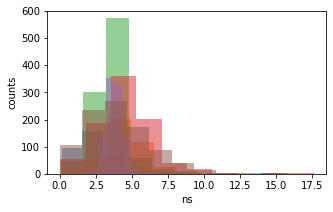
[22]:
fig, ax = plt.subplots(figsize=(5, 3))
bhm.dwell_tau_hist(bdata.models[2], ax=ax);

By default, dwell_tau_hist() only shows the mean nanotimes for the DexDem photon stream.
But what if we wanted to look at a different stream?
To do this we use the streams keyword argument.
It functions like the states keyword argument before (introduced in Displaying subsets of states ).
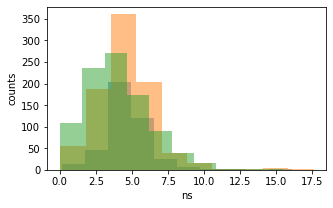
So, let’s look at the DexDemand DexAemstreams:
[23]:
fig, ax = plt.subplots(figsize=(5, 3))
streams = [frb.Ph_sel(Dex="Dem"), frb.Ph_sel(Dex="Aem")]
bhm.dwell_tau_hist(bdata.models[2], ax=ax, streams=streams);
Or just the D exAemstream:
[24]:
fig, ax = plt.subplots(figsize=(5, 3))
streams = [frb.Ph_sel(Dex="Aem")]
bhm.dwell_tau_hist(bdata.models[2], ax=ax, streams=streams);
Customizing plotting of photon streams#
For plots where there are specific selections per stream in addition to per state, the stream_kwargs keyword argument exists.
It functions much like the state_kwargs argument, matching the order of streams and needing to be the same length.
Also, state_kwargs and stream_kwargs merge dictionaries, so you can specify both, and not have a problem.
So let’s see an example:
[25]:
fig, ax = plt.subplots(figsize=(5, 3))
streams = [frb.Ph_sel(Dex="Dem"), frb.Ph_sel(Dex="Aem")]
stream_kw = [{'color':'b'}, {'color':'r'}]
bhm.dwell_tau_hist(bdata.models[2], ax=ax, streams=streams, stream_kwargs=stream_kw);

But now, the problem is we have no idea which state goes with what, so let’s use the states keyword argument to specify only the 0th state:
[26]:
fig, ax = plt.subplots(figsize=(5, 3))
streams = [frb.Ph_sel(Dex="Dem"), frb.Ph_sel(Dex="Aem")]
stream_kw = [{'color':'b'}, {'color':'r'}]
state = np.array([0])
bhm.dwell_tau_hist(bdata.models[2], ax=ax, streams=streams, stream_kwargs=stream_kw, states=state);

Finally, stream_kwargs and state_kwargs work together: the two dictionaries for a particular stream and state combination are merged:
Note
In the dictionary merging process, if the same key is present in both dictionaries, then the value in stream_kwargs will be used, and the values in state_kwargs over-written.
[27]:
fig, ax = plt.subplots(figsize=(5, 3))
streams = [frb.Ph_sel(Dex="Dem"), frb.Ph_sel(Dex="Aem")]
stream_kw = [{'color':'b'}, {'color':'r'}]
state_kw = [{'edgecolor':'darkblue'}, {'edgecolor':'darkorange'}, {'edgecolor':'olive'}]
bhm.dwell_tau_hist(bdata.models[2], ax=ax, streams=streams, stream_kwargs=stream_kw, state_kwargs=state_kw);
Control of Plotting State and Stream in Unified Argument Array#
Now, sometimes you need even more control, because the two keyword argument arrays clash. For this there is the kwarg_arr keyword argument. In kwarg_arr, you provide an array of dictionaries that will be the keyword arguments for ax.scatter() , the outer dimension indicates which state, and the inner dimension indicates which the stream.
Note
kwarg_arr is meant to take the place of the combination of state_kwargs and stream_kwargs .
As such, kwarg_arr and state_kwargs cannot be specified at the same time. If stream_kwargs is specified at the same time as kwarg_arr , then burstH2MM will make a check.
If kwarg_arr is formatted like state_kwargs , then it will be treated like state_kwargs .
On the other hand, if it is formatted as demonstrated below, stream_kwargs will be ignored, and a warning will be presented.
[28]:
fig, ax = plt.subplots(figsize=(6, 4))
kwarr = [[{'color':'g', 'label':'State 0, DexDem'},
          {'color':'darkgreen', 'label':'State 0, DexAem'}],
         [{'color':'r', 'label':'State 1, DexDem'},
          {'color':'darkred', 'label':'State1, DexAem'}],
         [{'color':'b', 'label':'State 2, DexDem'},
          {'color':'darkblue', 'label':'State2, DexAem'}]]
bhm.dwell_tau_hist(bdata.models[2], ax=ax, kwarg_arr=kwarr, streams=[frb.Ph_sel(Dex="Dem"), frb.Ph_sel(Aex="Aem")])
ax.legend();

So kwarg_arr allows the most customization, but is also the longest to define.
Plotting by dwell position and masking#
Dwell based plotting functions also include the dwell_pos keyword arguments.
This arguments allows the user to filter which dwells are plotted, not by state, but by the position (middle of the burst, start, stop or whole), and in its most advanced usage, by any user defined criterion.
There are several possible types of inputs to dwell_pos , but the most easily understood is by using one of the functions in the Masking module (see Using masking functions to make masks ).
So let’s see dwell_pos in action:
[29]:
fig, ax = plt.subplots(figsize=(5,5))
# plot only dwells in the middle of a burst
bhm.dwell_ES_scatter(bdata.models[2], dwell_pos=bhm.mid_dwell, ax=ax);

Note
Functions handed to the dwell_pos keyword argument must accept a H2MM_result objects as input, and return a mask of dwells
You will note many fewer points, as there are many beginning, ending and whole burst dwells removed.
It is also possible to specify dwells by specifying dwell_pos as an integer corresponding to the dwell position code used in the similarly named H2MM_result.dwell_pos parameter.
So to select the mid dwells, we give it 0:
[30]:
fig, ax = plt.subplots(figsize=(5,5))
# plot only dwells in the middle of a burst
bhm.dwell_ES_scatter(bdata.models[2], dwell_pos=1, ax=ax);

And to select the beginning of bursts:
[31]:
fig, ax = plt.subplots(figsize=(5,5))
# plot only dwells in the middle of a burst
bhm.dwell_ES_scatter(bdata.models[2], dwell_pos=2, ax=ax);
It is also possible to select multiple types of dwells by using an array of all interested codes:
[32]:
fig, ax = plt.subplots(figsize=(5,5))
# make array of code selections (beginning and whole burst dwells)
pos_sel = np.array([2,3])
# plot the selection
bhm.dwell_ES_scatter(bdata.models[2], dwell_pos=pos_sel, ax=ax);
Another method is to provide a mask of all the dwells, for example, all dwells with a stoichiometry greater than some threshold:
[33]:
fig, ax = plt.subplots(figsize=(5,5))
# make mask of dwells with stoichiometry greater than 0.5
dwell_mask = bdata.models[2].dwell_S > 0.5
# plot with a mask
bhm.dwell_ES_scatter(bdata.models[2], dwell_pos=dwell_mask, ax=ax)
# ensure full S range is plotted
ax.set_ylim([0,1]);

Now the previous example plots a selection that is not very useful, however, what if we want to exclude dwells with fewer than a certain number of photons?
Well, you could use H2MM_result.dwell_ph_counts to make a mask, but there is one Masking function that is different from the others, and will not work directly as an input to dwell_pos : this is dwell_size() which needs at least a minimum number of photons as input.
So here, we will employ a Python lambda function:
[34]:
fig, ax = plt.subplots(figsize=(5,5))
# plot with lambda function, sets ph_min at 10
bhm.dwell_ES_scatter(bdata.models[2], dwell_pos= lambda m: bhm.dwell_size(m, 10), ax=ax);

Thus you can hand functions that take H2MM_result object as input, and returns a mask as output to select dwells based on whatever parameters you want.
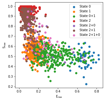
Burst Based Plotting#
What if you want to look not at individual dwells, but at how bursts differ based on the bursts within them?
For that there are the burst-based plots.
There is currently 1 burst-based plotting function, but more are likely to come in future versions.
This is burst_ES_scatter()
Now, instead of segmenting the data into dwells, we consider entire bursts, based on what states are present within them.
Under the hood, this is achieved using the H2MM_result.burst_type attribute.
This means the plots will now have points at the same positions as FRETBursts plotting functions, but will gain additional formatting depending on what states are present within them.
So let’s look at the basic plot produced from burst_ES_scatter()
[35]:
fig, ax = plt.subplots(figsize=(5,5))
bhm.burst_ES_scatter(bdata.models[2], ax=ax);

Now this plot has a lot of colors in it, and they aren’t labeled.
The number of colors scales with the square of the number of states, so you can imagine these plots get busy quickly.
So there is a keyword argument: flatten_dynamics .
If flatten_dynamics=True and then bursts will only be distinguished by whether any sort of transition occurs or if they only contain a single dwell/state:
[36]:
fig, ax = plt.subplots(figsize=(5,5))
bhm.burst_ES_scatter(bdata.models[2], flatten_dynamics=True,  ax=ax);

Finally, if you want to control the plotting by burst type, much like the state_kwargs keyword argument, there is the type_kwargs keyword argument.
So, what is the order that the list needs to be given?
Well that depends on if flatten_dynamics is True or False .
If it is False , then the order is based on the binary order, so it will go State0 only, then State1 only, then State1 and State0, then State2 etc:
[37]:
fig, ax = plt.subplots(figsize=(5,5))
type_kwargs = [
    {'label':'State 0'}, {'label':'State 1'},
    {'label':'State 0+1'}, {'label':'State 2'},
    {'label':'State 2+0'}, {'label':'State 2+1'},
    {'label':'State 2+1+0'}
]
bhm.burst_ES_scatter(bdata.models[2],type_kwargs=type_kwargs, ax=ax)
ax.legend();
If True then the order is simply State0, State1 … then finally, the last element will be “dynamic” bursts, i.e. a burst with any sort of dynamics:
[38]:
fig, ax = plt.subplots(figsize=(5,5))
type_kwargs = [
    {'label':'State 0'}, {'label':'State 1'},
    {'label':'State 2'}, {'label':'Dynamics'}
]
bhm.burst_ES_scatter(bdata.models[2],flatten_dynamics=True, type_kwargs=type_kwargs, ax=ax)
ax.legend();

That’s the end of this How-To, thank you for using burstH2MM.
Download this documentation as a jupyter notebook here: PlottingFunctions.ipynb